Multidisciplinary Design
Games and interactive experiences are basically multi-sensory simulations of fictional worlds that require bringing a broad collection of disciplines together to create an experience. I blended game, interaction, UX, UI, motion/animation, and sound design to weave a fabric that holds the experience together for players.
Something that deserves its own mention is the neuroaesthetic design portion at the end. Intention elevates craft, so I've been exploring neuroaesthetic design as a way to ground more of my choices in empirical science to develop elements that are optimized to produce the physiological responses I want for people.
Before getting into the details, here's a summary of the design brief:
- Awe-inspiring immersive features to captivate at the start, casual competition to motivate repeat sessions.
- App and gameplay experience that leans more meditative (over action, common fantasy, first-person shooter, role-playing, etc.).
- A neuroaesthetic design approach to enhance immersion (specifically awe), and maximize response to interaction feedback and player progress rewards.
- Fully native to take full advantage of the Vision Pro's capabilities in real-time 3D and 2D UI (no Unity or Unreal).
- Does not require controllers or other peripherals to play.
- Simplicity in gameplay for this first phase of development. No complicated scoring schemes, random rewards, in-game economies, etc.
Foundational App Structure And Flow
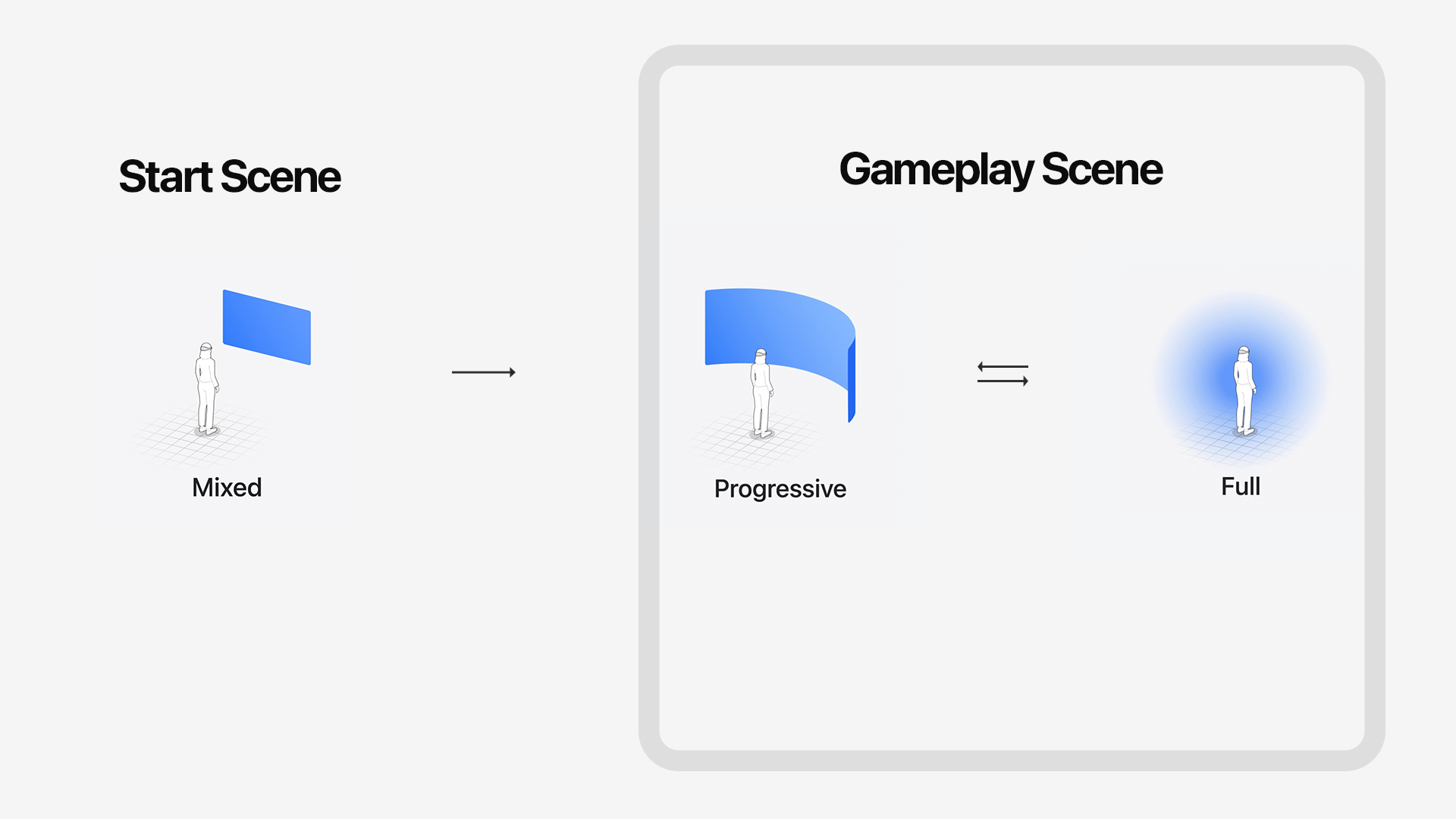
The app launches in shared space, a mixed reality view where any other active apps are visible. For gameplay, I implemented progressive immersion where players can choose between partial immersion (another mixed reality view) or full immersion in the game world. Giving players the option to select if they want to be fully immersed in gameplay or have access to a view of their physical surroundings was the most appropriate choice for this experience.
Gameplay Design
The Core Game Mechanic
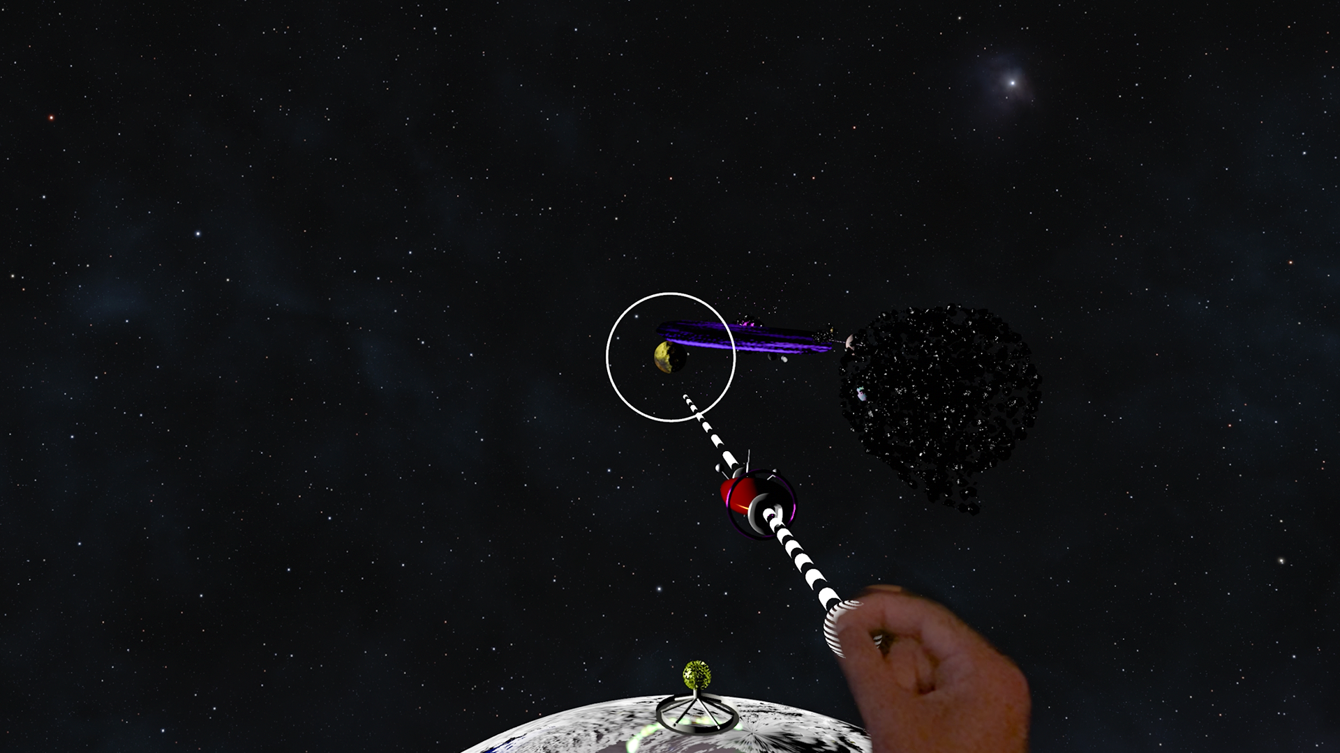
A “bow and arrow” interaction where you use a drag gesture to set a flight path before propelling your spacecraft toward an orbital target. The more precise you are, the better your odds of navigating the course in fewer jumps.
Competition Design
A very simple and easy to understand approach that is similar to golf. The smallest number of orbital jumps needed to complete the course is the winner or your personal best. For this development phase, I decided against time limits, bonuses, or other extras that would add complexity (likely uneeded) to the player experience.
Level Design
Level design is where the game is made strategic for players. Jumps need to be made to areas where there is enough gravity to lock into orbit and is a good position to launch from for the next jump. You need to watch your velocity to avoid overshooting your orbit target and also stay clear of hazards along the way. You also might discover shortcuts that can boost your score.
Systematized Level of Difficulty
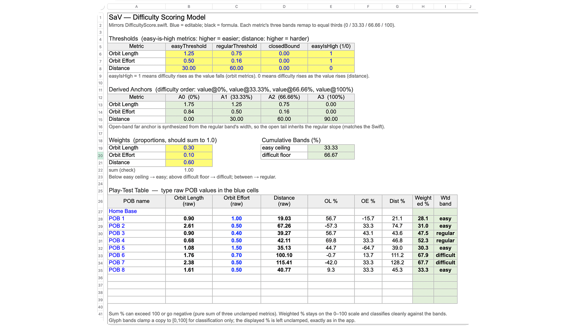
One of the most important tasks in level design for this game is estimating the amount of difficulty you program into challenges, obstacles, etc., and for the level overall. It could have been a subjective process requiring a lot of play testing and effort to tune, but fortunately, I was able to come up with this clever little system and spreadsheet that scores the level of difficulty for the jumps in the course.
One of the most important tasks in level design for this game is estimating the amount of difficulty you program into challenges, obstacles, etc., and for the level overall. It could have been a subjective process requiring a lot of play testing and effort to tune, but fortunately, I was able to come up with this clever little system and spreadsheet that scores the level of difficulty for the jumps in the course.
Rather than blocking out a level design, exporting a build for the device, play testing for 10 minutes, making notes, and then doing that whole process over again five or more times, I could run through a much smaller number of shorter iterations by starting with calculating level of difficulty scores for each jump in this spreadsheet. That made the process for planning the level and dialing in difficulty exponentially faster and easier. And it gave me a mechanism for easily adding a new and useful new piece of gameplay data for players: jump difficulty estimates.
Rather than blocking out a level design, exporting a build for the device, play testing for 10 minutes, making notes, and then doing that whole process over again five or more times, I could run through a much smaller number of shorter iterations by starting with calculating level of difficulty scores for each jump in this spreadsheet. That made the process for planning the level and dialing in difficulty exponentially faster and easier. And it gave me a mechanism for easily adding a new and useful new piece of gameplay data for players: jump difficulty estimates.
Spatial And Environment Design: Scale For Realism Or Scale To Accommodate Gameplay and Art?
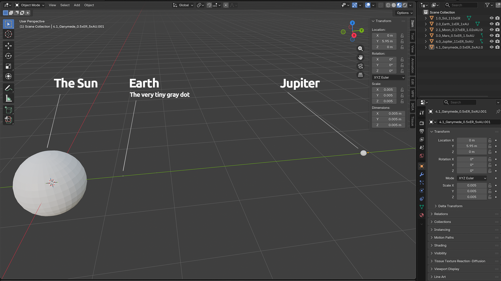
While I was researching (via watching hours of astronomy videos), I kept getting my mind blown by how massive objects and the space between them are. Jupiter is about 11 times the size of our little Earth, and the sun is 109 times bigger. It took the Voyager spacecraft 12 years to reach Neptune from Earth.
While I was researching (via watching hours of astronomy videos), I kept getting my mind blown by how massive objects and the space between them are. Jupiter is about 11 times the size of our little Earth, and the sun is 109 times bigger. It took the Voyager spacecraft 12 years to reach Neptune from Earth.
I wanted to simulate that vastness by referencing the scale of our solar system's objects and the voids between them to design levels that deliver novel visual experience and provide the basis for difficulty ratings. I even created a custom astronomical measurement system for the game world (stellar units, centi-stellar units, and quantum-stellar units). The gigantic scale made many aspects of visual and gameplay design much more challenging, but it resulted in a signature element of the game that enhances immersion and makes it a unique experience.
Level Art
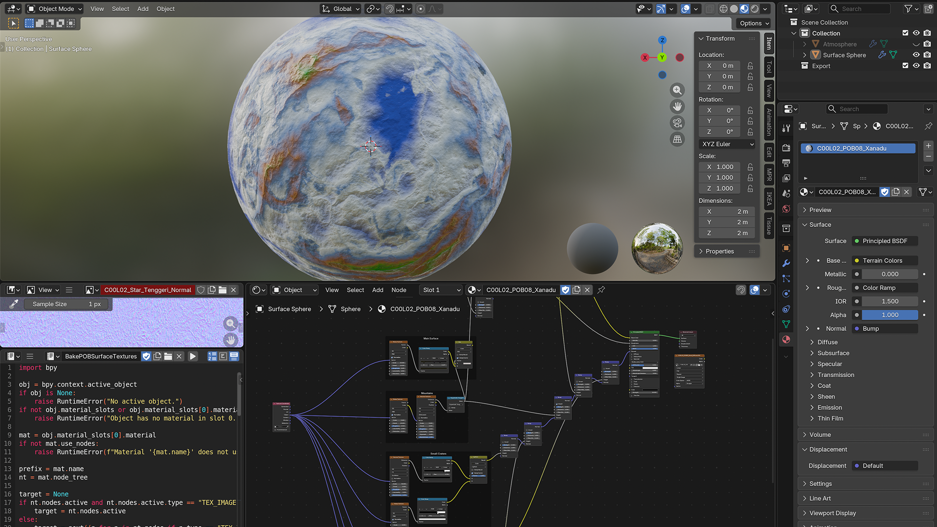
My research also brought to light the unimaginable composition of objects in our galaxies. Just in the inner core of our solar system, we have gas giants with ribbons of colossal storms and no solid ground, contrasted with the dry and rocky planets that have atmospheres too thin to generate visible clouds. There's a planet with hundreds of moons in many varieties, and two planets with no natural satellites.
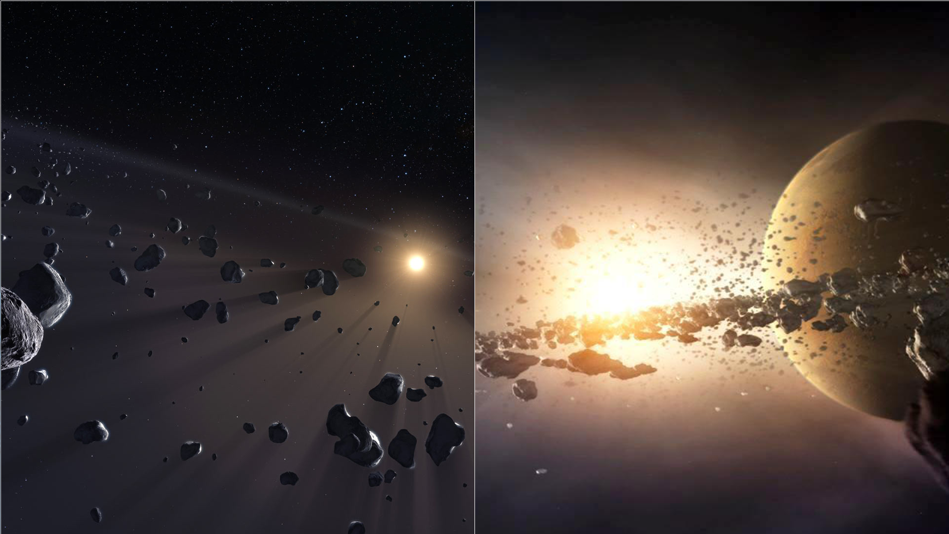
Things get weirder when you travel out to the Kuiper Belt, which is a huge donut-shaped field of icy objects, one with ice volcanoes that blast giant plumes of volatile gases into space. Pluto, the former planet and now Kuiper Belt object, orbits in tandem around a central point it shares with its moon, Charon, which is half of its size. And there's possibly a giant cloud of gas floating about after a recent collision of objects.
My research also brought to light the unimaginable composition of objects in our galaxies. Just in the inner core of our solar system, we have gas giants with ribbons of colossal storms and no solid ground, contrasted with the dry and rocky planets that have atmospheres too thin to generate visible clouds. There's a planet with hundreds of moons in many varieties, and two planets with no natural satellites.
Things get weirder when you travel out to the Kuiper Belt, which is a huge donut-shaped field of icy objects, one with ice volcanoes that blast giant plumes of volatile gases into space. Pluto, the former planet and now Kuiper Belt object, orbits in tandem around a central point it shares with its moon, Charon, which is half of its size. And there's possibly a giant cloud of gas floating about after a recent collision of objects.
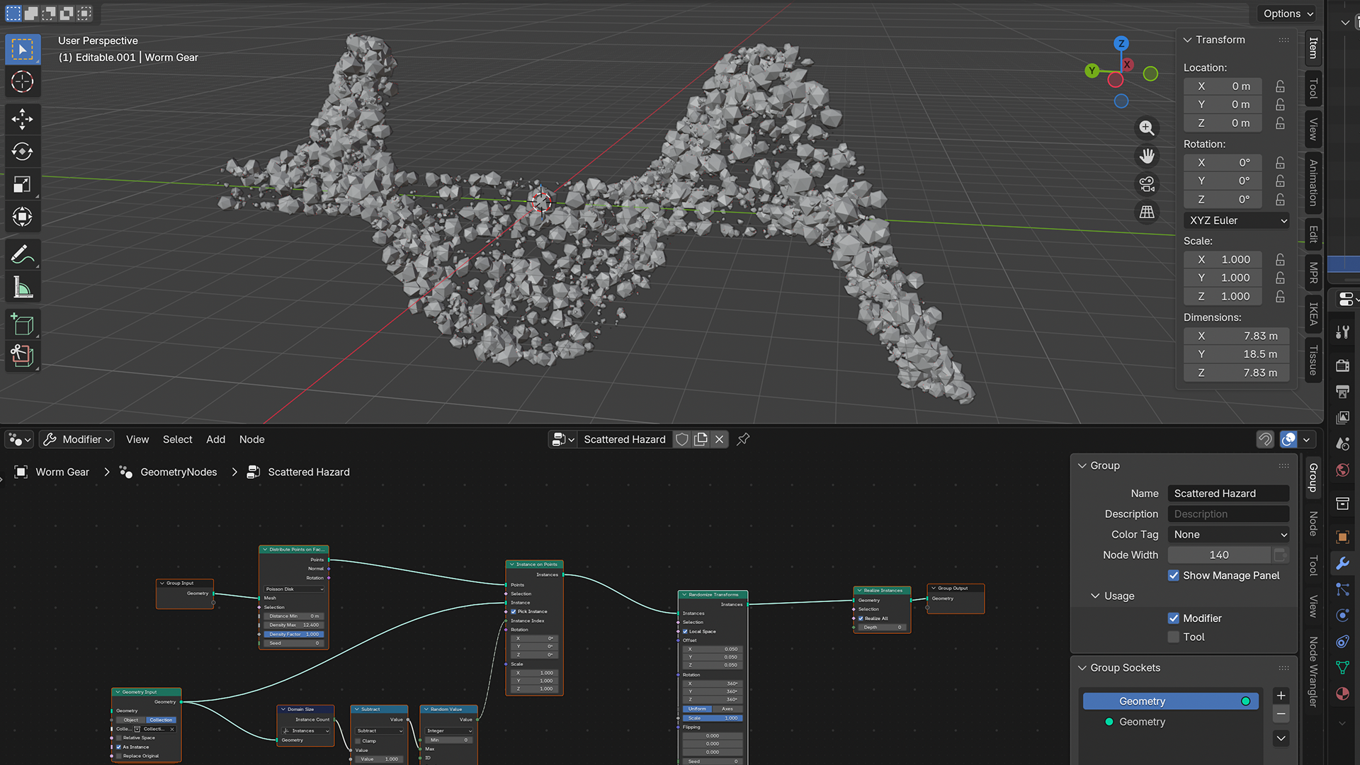
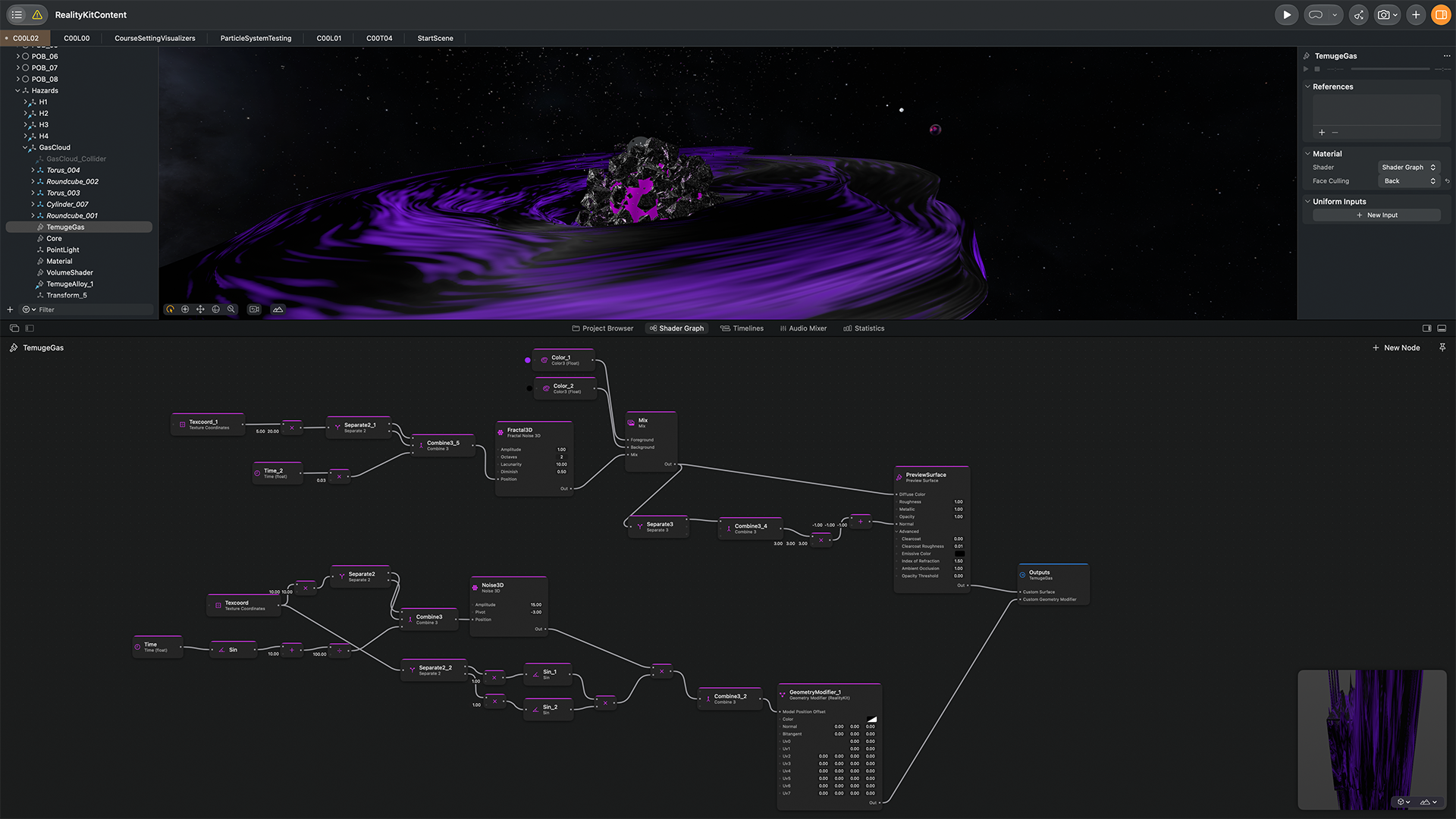
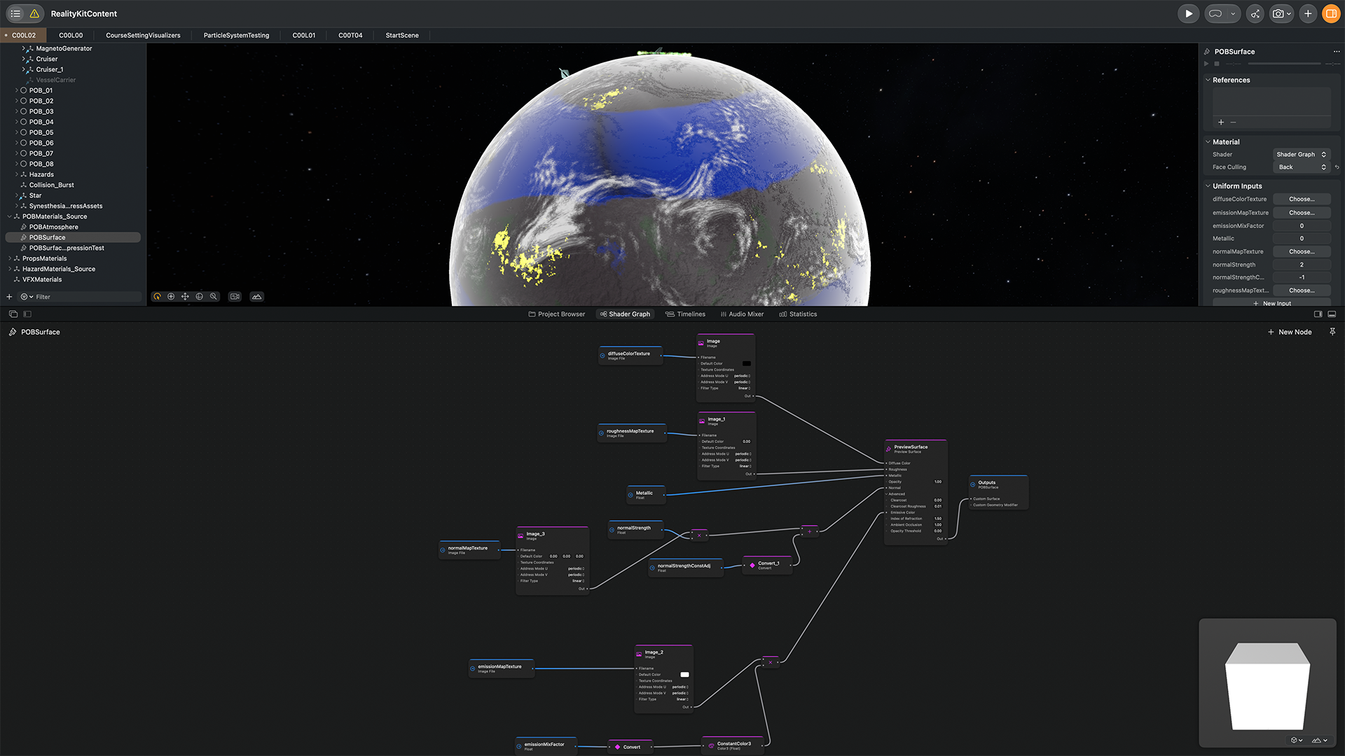
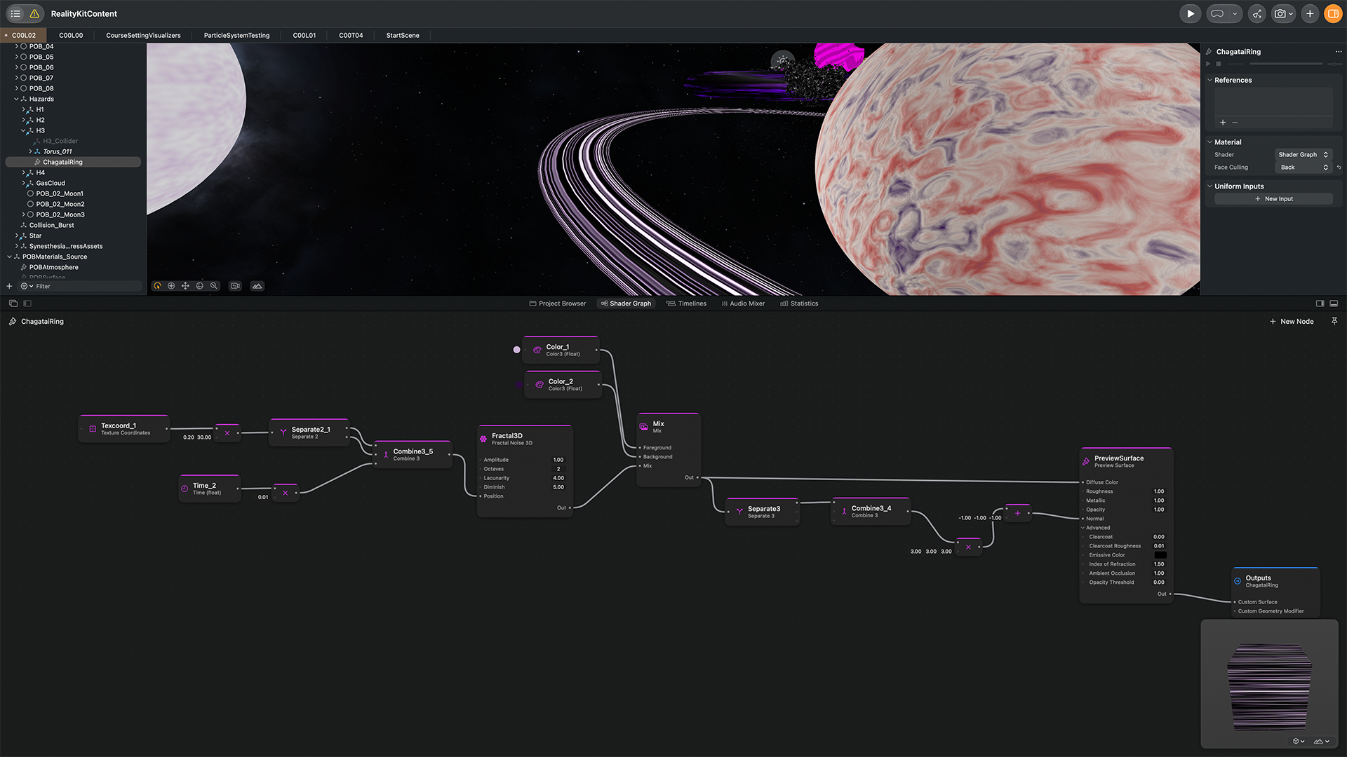
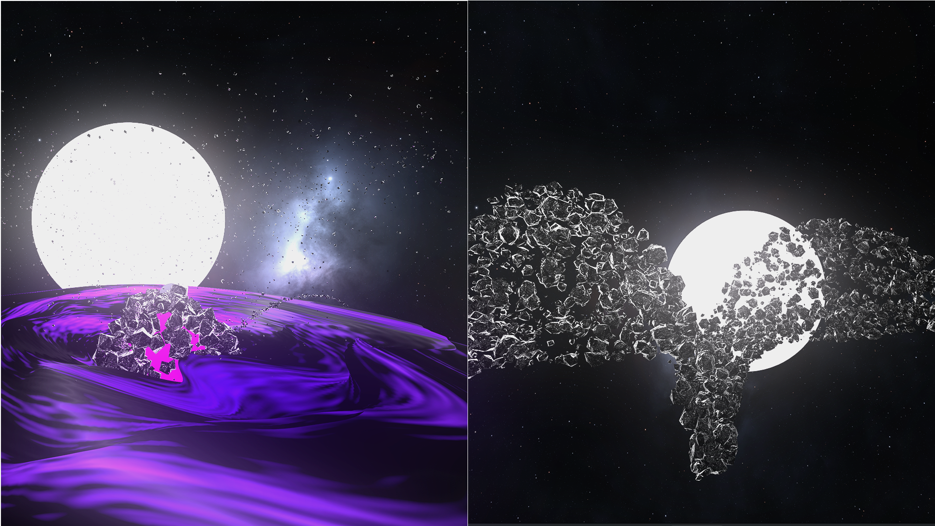
And far beyond our solar system, objects become unfathomable when you consider galactic phenomena such as black holes, pulsars, quasars, etc. All of this results in an art direction inspired by these oddities, where planets in a level can look like Earth or an orbital body made of molten metal oceans and volcanic terrain. And hazards that provide obstacles to orbital jumps range from giant fields of alloy debris to gas clouds or clusters of moons orbiting a planet.
Kuiper Belt artist renderings from NASA and PBS
Sanctuaries and Voids level art samples
Interaction Design: UX, UI, Motion, And Sound
If game design and level design are the game, interaction design is the layer that enables people to effectively consume the game. This section is a breakdown of all the different interaction design elements I created to make this concept as smooth a player experience as possible.
Interaction design for the core game mechanic, spacecraft launching
After evaluating a small list of options, I decided a “bow and arrow” styled drag gesture was the best mix of “natural interaction,” ergonomics (it’s comfortable for long periods of play), visual simplicity, and fun.
I could give players a bunch of directional buttons to press to aim the spacecraft—pretty boring and not very visually elegant. I could break the interaction into a wheel for aiming, a separate control to set propulsion, and a button to launch. Three separate controls also isn’t a very elegant approach.
So I chose the drag-and-set approach shown below that combines direction and propulsion into one easy and playful control. You can see in the code that it’s a tunable system where steps in the drag interval can be adjusted, delays can be added for visual smoothing, and a gate is in place to remove some jerkiness that can happen at very small drag distances.
Code For The Gesture
/// Drag and set gesture
/// Ellipses (...) are lines removed to keep the code sample brief

struct SatelliteForceDragGesture: Gesture {
    @Environment(AppModel.self) var appModel

    @State private var lastForceUpdateTime: TimeInterval = 0
    @State private var lastThrustInterval: Int = 0
    private let forceUpdateInterval: TimeInterval = DS.Satellite.dragSampleInterval

    private let thrustTickStep: Float = 0.005
    private let rotationSmoothing: Float = 0.3  // 0 = no rotation, 1 = instant snap (old behavior)
    private let minLookDistance: Float = 0.03

var body: some Gesture {
        EntityDragGesture { entity, targetPosition in
            	...
            }

            let currentPosition = satellite.position(relativeTo: nil)

            let now = CACurrentMediaTime()
            if now - lastForceUpdateTime >= forceUpdateInterval {
                let direction = targetPosition - currentPosition
                let strength = simd_length(direction)
                let force = DS.Satellite.launchVelocityPerDragMeter * strength * simd_normalize(-direction)
                	...
                }

                lastForceUpdateTime = now
            }

            let lookVector = targetPosition - currentPosition
            if simd_length(lookVector) > minLookDistance {
            	...
            }
        }
        .onEnded { _ in
            lastForceUpdateTime = 0
        }
    }
}
The Gameplay HUD (Heads-Up Display)
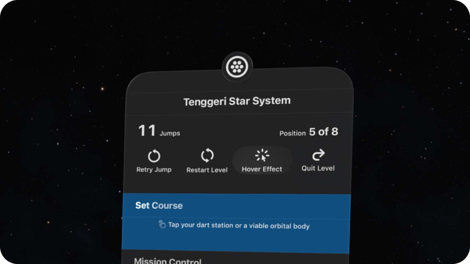
This is the most important element for giving players control over gameplay, and where I applied all of the common 2D UI approaches seen in our everyday apps: 2D visual hierarchy, typography, iconography, discoverability, progressive disclosure, emphasis, motion, spacing, state, etc.
It is a lightly data-dense UI where I needed to distribute a few different groups of numeric data into a layout that makes it easy for players to find frequently used gameplay info at a glance. Basic Swiss Design principles were a good guide for apportioning this layout (as they are for most modern UIs).
This is the most important element for giving players control over gameplay, and where I applied all of the common 2D UI approaches seen in our everyday apps: 2D visual hierarchy, typography, iconography, discoverability, progressive disclosure, emphasis, motion, spacing, state, etc.
It is a lightly data-dense UI where I needed to distribute a few different groups of numeric data into a layout that makes it easy for players to find frequently used gameplay info at a glance. Basic Swiss Design principles were a good guide for apportioning this layout (as they are for most modern UIs).
Also, the HUD can be moved anywhere the player wants and has a slim, vertically oriented profile, both of which are important for this game, where I want players to have plenty of opportunity to enjoy panoramic views of the star systems they travel through.
An essential UI element that is separate from the HUD's window is the simple white ring that is activated to help players visualize the orbit area they can target for their jump to a new planet. I went through a few versions for this element: a semitransparent sphere, and then two white rings (one to represent depth). But one simple ring on one plane provides the info needed without cluttering the game scene.
Building Dynamically Scaled Tap Targets
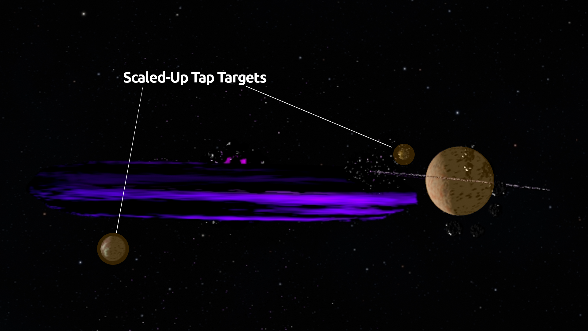
I built a small system that calculates tap target sizes for a specific class of objects because this game has a pretty unique problem: it places targetable planets extremely far off in distance from the player—necessary to make the game challenging but means you will have instances where even a large planet is tiny in the field of view and very difficult to trigger the on-hover function to select it.
I built a small system that calculates tap target sizes for a specific class of objects because this game has a pretty unique problem: it places targetable planets extremely far off in distance from the player—necessary to make the game challenging but means you will have instances where even a large planet is tiny in the field of view and very difficult to trigger the on-hover function to select it.
So I came up with an angular sizing system that crunches together the size of the planet and how far it is from the player to determine if the tap target area needs to be scaled up to make it much easier to trigger on-hover. Not being able to select visible planets was a huge frustration while testing, so that purely interaction/UX-focused piece of programming is critical for the app and ensures that tap targets
So I came up with an angular sizing system that crunches together the size of the planet and how far it is from the player to determine if the tap target area needs to be scaled up to make it much easier to trigger on-hover. Not being able to select visible planets was a huge frustration while testing, so that purely interaction/UX-focused piece of programming is critical for the app and ensures that tap targets
Tap Assist Code Samples
    /// Tap Assist parameters

    private let tapAssistEnabled: Bool = true
    private let tapAssistMinDistance: Float = 20.0
    private let tapAssistMaxDistance: Float = 150.0
    private let tapAssistTargetAngularSize: Float = 0.05
    private let tapAssistAngularSizeCeiling: Float = 0.05
    private let tapAssistMaxScale: Float = 2.0
    private let tapAssistBaseRadiusFactor: Float = 1.0

    var tapAssistDebugVisible: Bool = false {
        didSet {
            guard tapAssistDebugVisible != oldValue else { return }
            for (key, proxy) in tapProxiesByPOB {
                let radius = tapProxyBaseRadiusByPOB[key] ?? 0.001
                applyTapAssistDebugMesh(to: proxy, baseRadius: radius)
            }
        }
    }


  /// One of the Tap Assist methods -- calculates scale adjustment amount

    private func assistScale(
        baseRadius: Float,
        pobWorldPos: SIMD3<Float>,
        satelliteWorldPos: SIMD3<Float>
    ) -> Float {
        let distance = simd_length(pobWorldPos - satelliteWorldPos)

        guard distance >= tapAssistMinDistance,
              distance <= tapAssistMaxDistance else { return 1.0 }
        guard baseRadius > 0 else { return 1.0 }

        let naturalAngularSize = baseRadius / distance

        guard naturalAngularSize < tapAssistAngularSizeCeiling else { return 1.0 }

        let rawScale = tapAssistTargetAngularSize / naturalAngularSize
        return min(max(rawScale, 1.0), tapAssistMaxScale)
}Building An Affordance And System For Managing The Hover Effect
A small but noteworthy UX affordance-related detail that I added to this project is the option to toggle the cursor’s hover effect on/off. A detail that makes visionOS’ usability outstanding is the cursor highlighting used for the eye tracking pointer system. A nice white gradient overlay lets users know when they’ve hovered over an interactive element, and it’s usually necessary for navigation.
But there are situations where the hover effect is a bit distracting, and it’s typically present in apps built around viewing and interacting with well-crafted 3D objects. Looking at the object means you’ll trigger the hover effect highlight, which brightens the lighting that was designed for the object, which means you’re now looking at the object with lighting that wasn’t the intention when designing it. It’s trivial for one or a few instances, but when it occurs frequently over a session, it can add up to a memorable distraction.
A small but noteworthy UX affordance-related detail that I added to this project is the option to toggle the cursor’s hover effect on/off. A detail that makes visionOS’ usability outstanding is the cursor highlighting used for the eye tracking pointer system. A nice white gradient overlay lets users know when they’ve hovered over an interactive element, and it’s usually necessary for navigation.
But there are situations where the hover effect is a bit distracting, and it’s typically present in apps built around viewing and interacting with well-crafted 3D objects. Looking at the object means you’ll trigger the hover effect highlight, which brightens the lighting that was designed for the object, which means you’re now looking at the object with lighting that wasn’t the intention when designing it. It’s trivial for one or a few instances, but when it occurs frequently over a session, it can add up to a memorable distraction.
I noticed it was a problem for my game where after only a minute of playing, you learn that the spacecraft and planets can be interacted with, so the hover effect becomes less useful and more of a distraction due to the constant on/off highlighting of objects when you move your focus.
Thankfully, Apple gives you an API to handle that issue, and I used it to give players the option to toggle the hover effect on or off, set its intensity, and choose a color. Having it on is useful for new players getting oriented and can also help experienced players when viewing small targets off in the distance.
Hover Effect Code Sample
/// Hover Effect controls in App Model

var showHoverEffectInGameplay: Bool = false
var hoverEffectStrength: CGFloat = 0.5
var hoverEffectColor: UIColor = .white

func makeGameplayHoverComponent() -> HoverEffectComponent {
    let style = HoverEffectComponent.SpotlightHoverEffectStyle(
        color: hoverEffectColor,
        strength: Float(hoverEffectStrength)
    )
    return HoverEffectComponent(.spotlight(style))
}
UI Motion Design
Obviously, I programmed a lot of animation in many varieties for this project. This section includes specific UI motion designs I created and programmed for the gameplay HUD. All animations in the HUD were created to draw attention to important info and signal important events and changes in state.
Obviously, I programmed a lot of animation in many varieties for this project. This section includes specific UI motion designs I created and programmed for the gameplay HUD. All animations in the HUD were created to draw attention to important info and signal important events and changes in state.
Section expand-collapse is the most prominent UI animation and necessary for signaling player turn events, guiding focus, and hiding unneeded info.
Light sweeps subtly draw attention to the active section's title;
Pulse animation added to a glyph to gently nudge for the required action.
The orbit visualizer ring for targeting uses the typical entry and exit easings to animate its scale.
HUD Motion Code Walkthrough
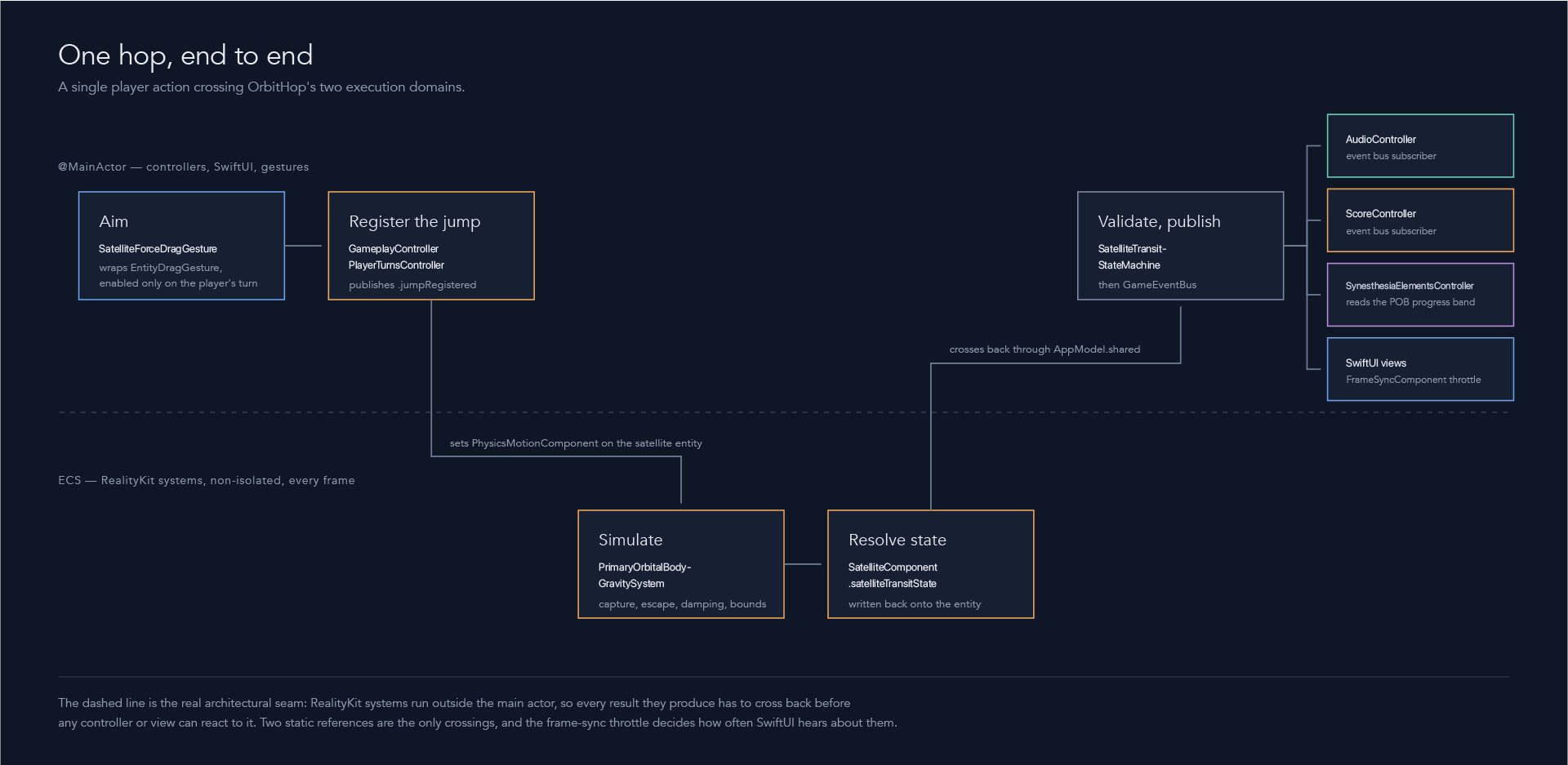
This is a bit of an experiment for my portfolio project presentations. The artifact below is an asset I had Claude generate for a walkthrough and description of the code that handles the section expand-collapse animations in the gameplay HUD. Without showing the lines of code used, it illustrates the complexity required to make some pretty standard UI animations possible.
This is a bit of an experiment for my portfolio project presentations. The artifact below is an asset I had Claude generate for a walkthrough and description of the code that handles the section expand-collapse animations in the gameplay HUD. Without showing the lines of code used, it illustrates the complexity required to make some pretty standard UI animations possible.
Design System
Something that is a bit different these days is designers having more access and interaction with the engineering aspect of design systems. Designers are more likely to write tokens and also convert them to the parameters or variables used in code to define components. For designer-builders like me, we bridge the design and engineering pieces of design systems and can bypass much of the low-value handoff work that has become ritual in the design workflow.
Something that is a bit different these days is designers having more access and interaction with the engineering aspect of design systems. Designers are more likely to write tokens and also convert them to the parameters or variables used in code to define components. For designer-builders like me, we bridge the design and engineering pieces of design systems and can bypass much of the low-value handoff work that has become ritual in the design workflow.
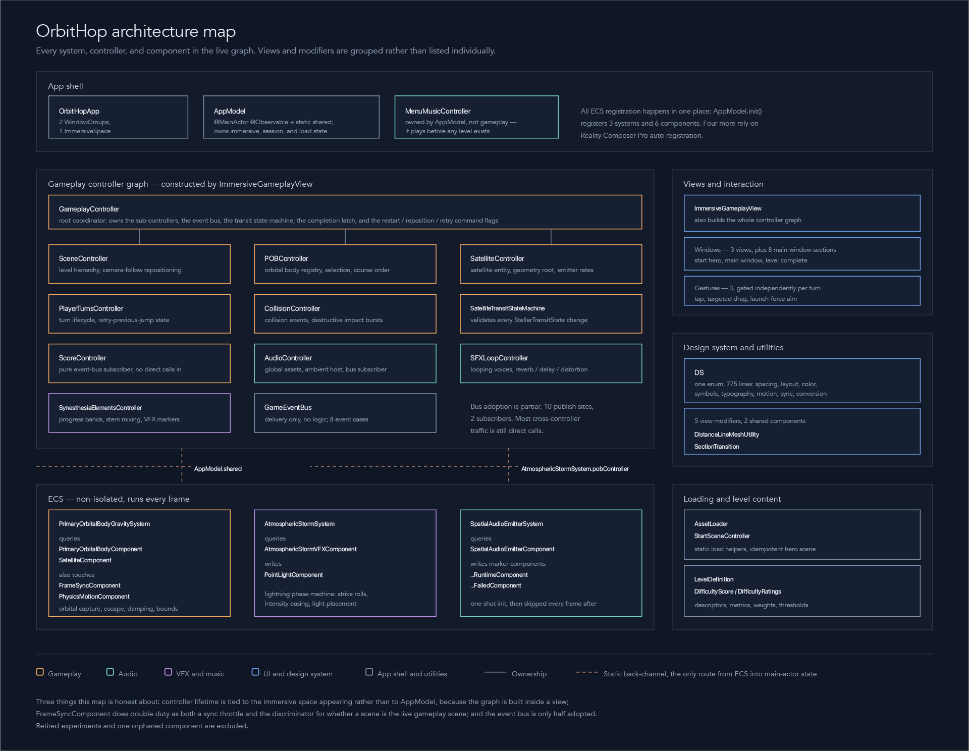
The images below show the structure of my design system in code for UI elements of the game, which is basically a section for defining primitives, then a section where primitives are used to create semantics for re-useable properties, and finally a section for more complex re-useable structures.
Design System Primitives Sample
// MARK: - Primitive Tokens
// Raw values only. Never referenced directly in views
// Ellipses (...) are lines removed to keep the code sample brief

private enum Primitive {

    enum Spacing {
        ...
    }

    enum Radius {
        static let medium: CGFloat = 12
        static let large: CGFloat  = 16
    }

    enum Color {
        static let green20 = SwiftUI.Color.green.opacity(0.2)
        static let red20   = SwiftUI.Color.red.opacity(0.2)
        static let white20 = SwiftUI.Color.white.opacity(0.2)
        	...
    }

    enum Symbol {
        static let circleHexagongridCircle = "circle.hexagongrid.circle"
        static let circleFill  = "circle.fill"
        static let squareFill  = "square.fill"
        static let diamondFill = "diamond.fill"
        static let arrowUp            = "arrow.up"
        static let arrowLeftAndRight  = "arrow.left.and.right"
        static let arrowUpAndDown     = "arrow.up.and.down"
	}

    enum Motion {
        static let springResponse: Double = 0.5
        static let springDamping: Double = 0.82
        static let stagger: Double = 0.08
        static let tintDuration: Double = 0.3
}
Design System Semantics Sample
// MARK: - Design System (Semantic Tokens)
// Named by purpose, not by value. These are the only tokens views should reference.

enum DS {

    enum Spacing {
        static let unit: CGFloat            = Primitive.Spacing.space1
        static let unitHalf: CGFloat        = Primitive.Spacing.space0_5
        static let windowPadding: CGFloat   = Primitive.Spacing.space3
        static let sectionVertical: CGFloat = Primitive.Spacing.space2
        static let sectionLabel: CGFloat    = Primitive.Spacing.space0_5
        static let appControlsBottom: CGFloat = Primitive.Spacing.space4
    }

    enum Layout {
        static let windowWidth: CGFloat = 364
        static let buttonHeight: CGFloat = Primitive.Spacing.space5
        static let controlButtonHighlightRadius: CGFloat = Primitive.Radius.medium
        static let controlButtonDisabledOpacity: Double = 0.35
        static let controlButtonHighlightPadding: CGFloat = Primitive.Spacing.space1
        static let glyphHoverPadding: CGFloat = Primitive.Spacing.space0_5
        static let labelSweepBandOpacity: Double = 1.0
        static let labelSweepBandWidth: CGFloat = 0.3
        static let labelSweepTextOpacity: Double = 0.8
        static let difficultyIconSlot: CGFloat = Primitive.Spacing.space1
    }

    enum Motion {
        static let sectionExpand: Animation = .spring(
            response: Primitive.Motion.springResponse,
             dampingFraction: Primitive.Motion.springDamping
        )
        static let sectionStagger: Double = Primitive.Motion.stagger
        static let sectionTint: Animation = .easeInOut(duration: Primitive.Motion.tintDuration)
        static let labelSweepDuration: Double = Primitive.Motion.labelSweepDuration
        static let labelSweepPause: Double = Primitive.Motion.labelSweepPause
        static let resultFade: Animation = .easeOut(duration: Primitive.Motion.resultFadeDuration)
        static let contentCrossFade: Animation = .easeInOut(duration: Primitive.Motion.contentCrossFadeDuration)
        static let numericRoll: Animation = .easeInOut(duration: Primitive.Motion.numericRollDuration)
    }
Design System ViewModifier (Instructions For Components) Sample
/// Styles a Text as a section label: caption font, full width, left-aligned.
/// When `isActive`, a brighter band sweeps across the (always full-brightness)
/// label, eases to the right edge, rests off-screen, then repeats — additive
/// highlight, never dims the text.
struct SectionLabelModifier: ViewModifier {
    var isActive: Bool = false

    /// Measured label width, needed to size and position the moving band.
    @State private var width: CGFloat = 0
    /// Measured label height, used to extend the band's horizontal travel so a
    /// diagonal band fully clears the glyphs at both ends.
    @State private var height: CGFloat = 0

    func body(content: Content) -> some View {
        // Full-opacity styled label. Used as the band's mask so the sweep reaches
        // full strength regardless of how dim the displayed text is.
        let maskShape = content
            .font(DS.Typography.bodyBold)
            .frame(maxWidth: .infinity, alignment: .leading)
            .padding(.vertical, DS.Spacing.sectionLabel)

        return maskShape
            // Both active and inactive labels rest at this dimmed opacity so they
            // read as a matched pair; "active" adds the sweep on top, it doesn't
            // change the base brightness.
            .opacity(DS.Layout.labelSweepTextOpacity)
            .background {
                GeometryReader { proxy in
                    Color.clear
                        .onAppear {
                            width = proxy.size.width
                            height = proxy.size.height
                        }
                        .onChange(of: proxy.size.width) { _, w in width = w }
                        .onChange(of: proxy.size.height) { _, h in height = h }
                }
            }
            .overlay { sweepOverlay(masking: maskShape) }
}Sound Design
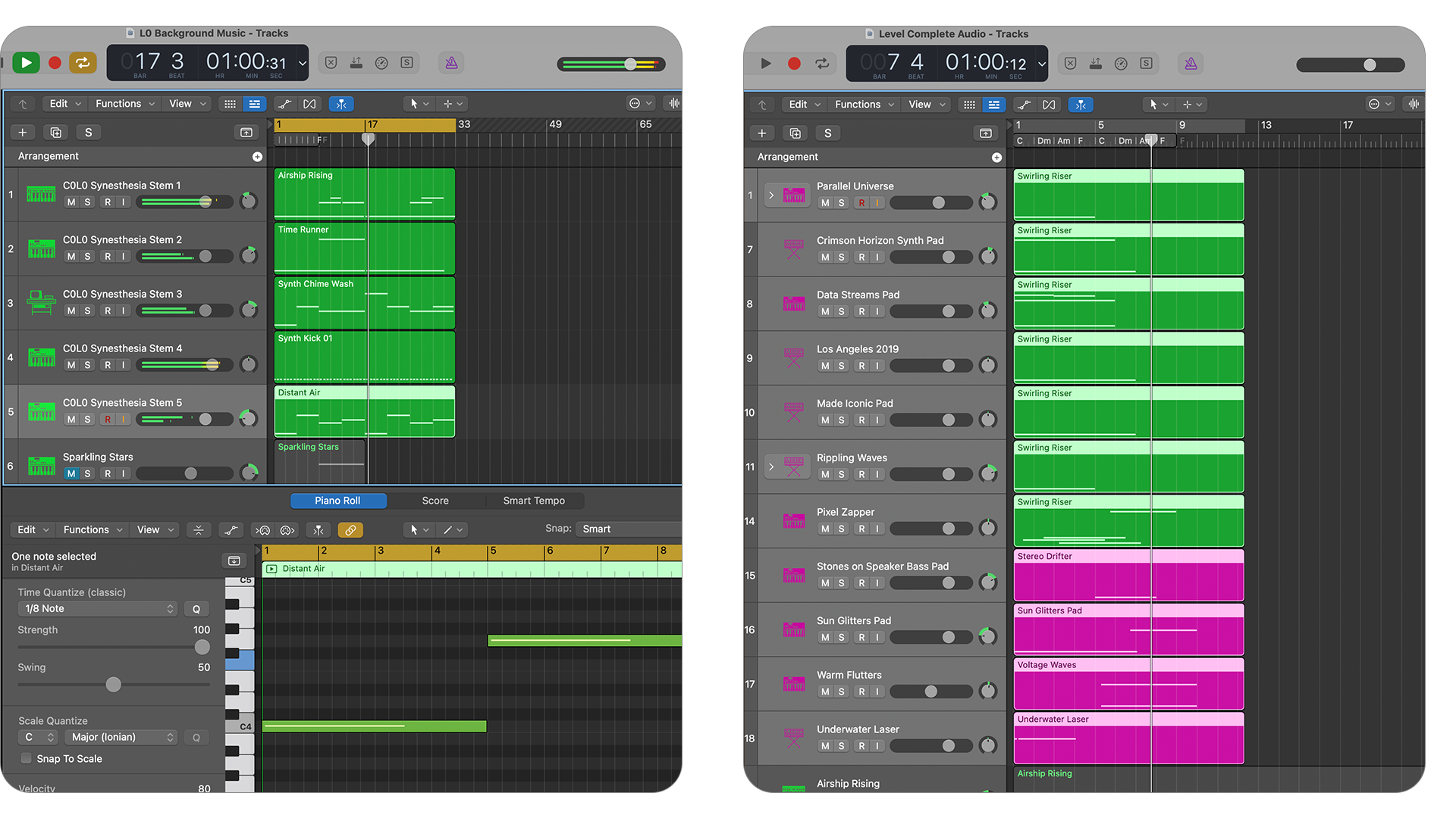
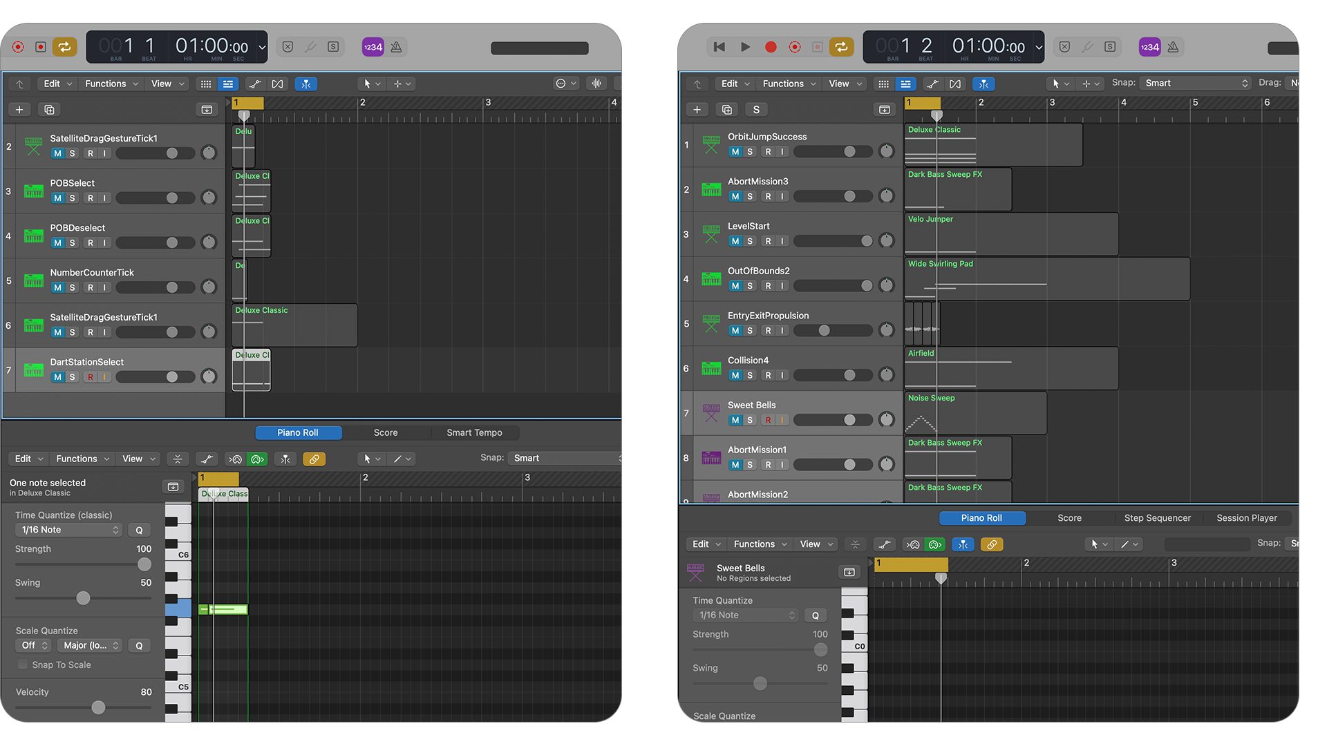
Everything you hear in the experience was created by me in Logic Pro: music, gameplay SFX, and UI SFX. I was facing a bit of a dilemma where easy and low-cost music and SFX licensing for gaming is not as abundant as it is for video projects. So I was a little worried that composing my own work would take too much time and not get the moods I wanted. But it probably ended up getting me exactly the moods I wanted in the same amount or less time than searching through libraries of stock assets.
Everything you hear in the experience was created by me in Logic Pro: music, gameplay SFX, and UI SFX. I was facing a bit of a dilemma where easy and low-cost music and SFX licensing for gaming is not as abundant as it is for video projects. So I was a little worried that composing my own work would take too much time and not get the moods I wanted. But it probably ended up getting me exactly the moods I wanted in the same amount or less time than searching through libraries of stock assets.
Gameplay Music Samples
Successful Jump
Level Start
Level Complete
Out of Bounds
UI And Gameplay SFX Samples
POB Select
POB Deselect
Dart Station Select
Explosion
Screenshots from the Logic Pro work
Neuroaesthetic Design
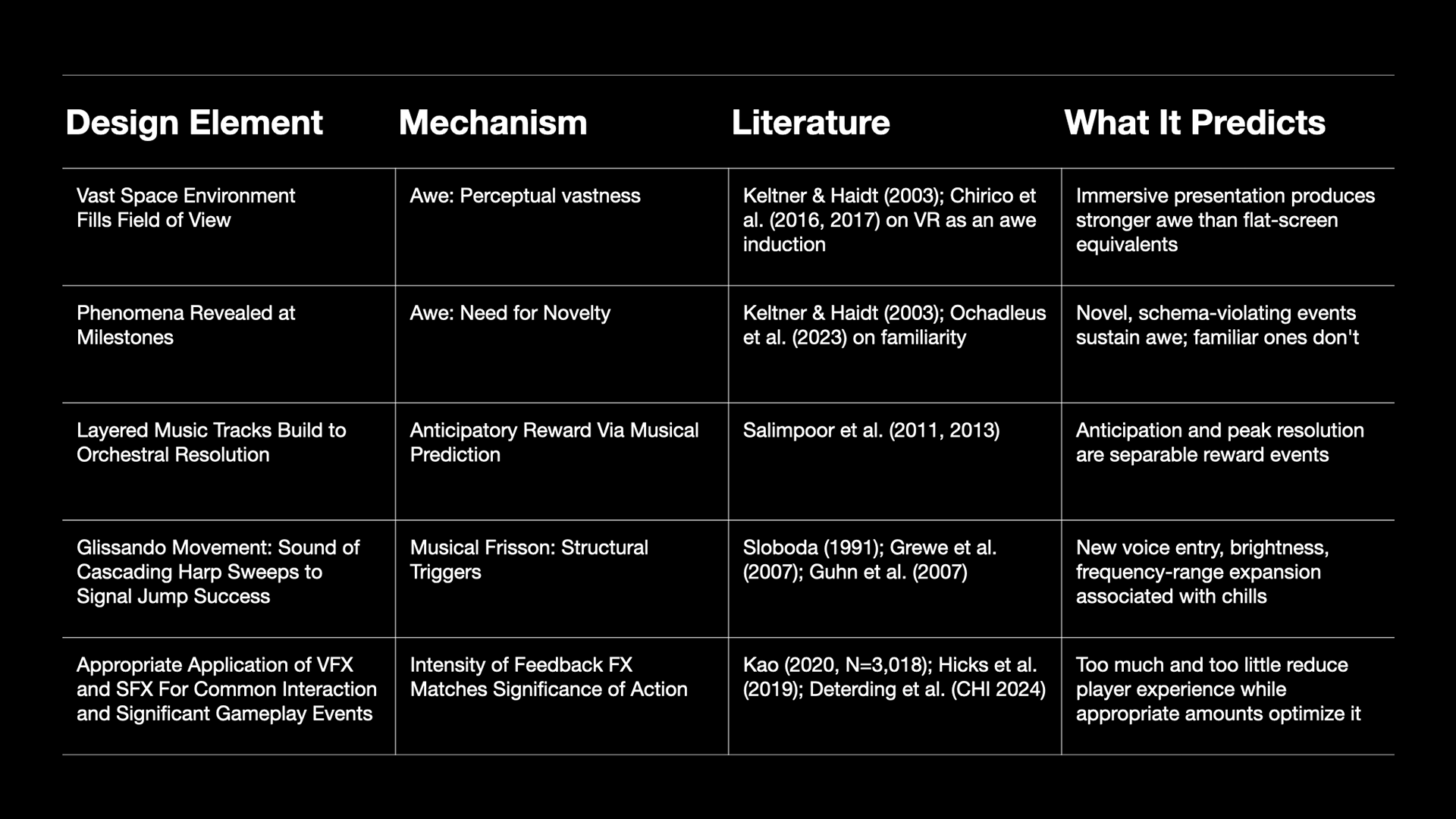
For this project, neuroaesthetic design is the practice of making aesthetic decisions using research findings from neuroscience and empirical psychology on how the brain processes beauty, pleasure, and emotion. The aim is to treat specific visual and sonic choices as predictable perceptual responses rather than mostly matters of taste. The majority of aesthetic choices in all domains of art and design will always be subjective, frequently fickle, and driven by perspective, but there are plenty of opportunities to enhance the impact of designs with identifiable visual, aural, and tactile characteristics that produce predictable sensory responses across the general population.
I implemented a set of five neuroaesthetic design elements for this experience that are derived from empirical findings on how specific visual and audio characteristics shape perception and emotion, in several cases down to measurable physiological response. The elements play various roles that include enhancement of signals/feedback that communicate gameplay events and state; inducing the emotional state of awe; rewarding player achievements, and adding ambiguous narrative.